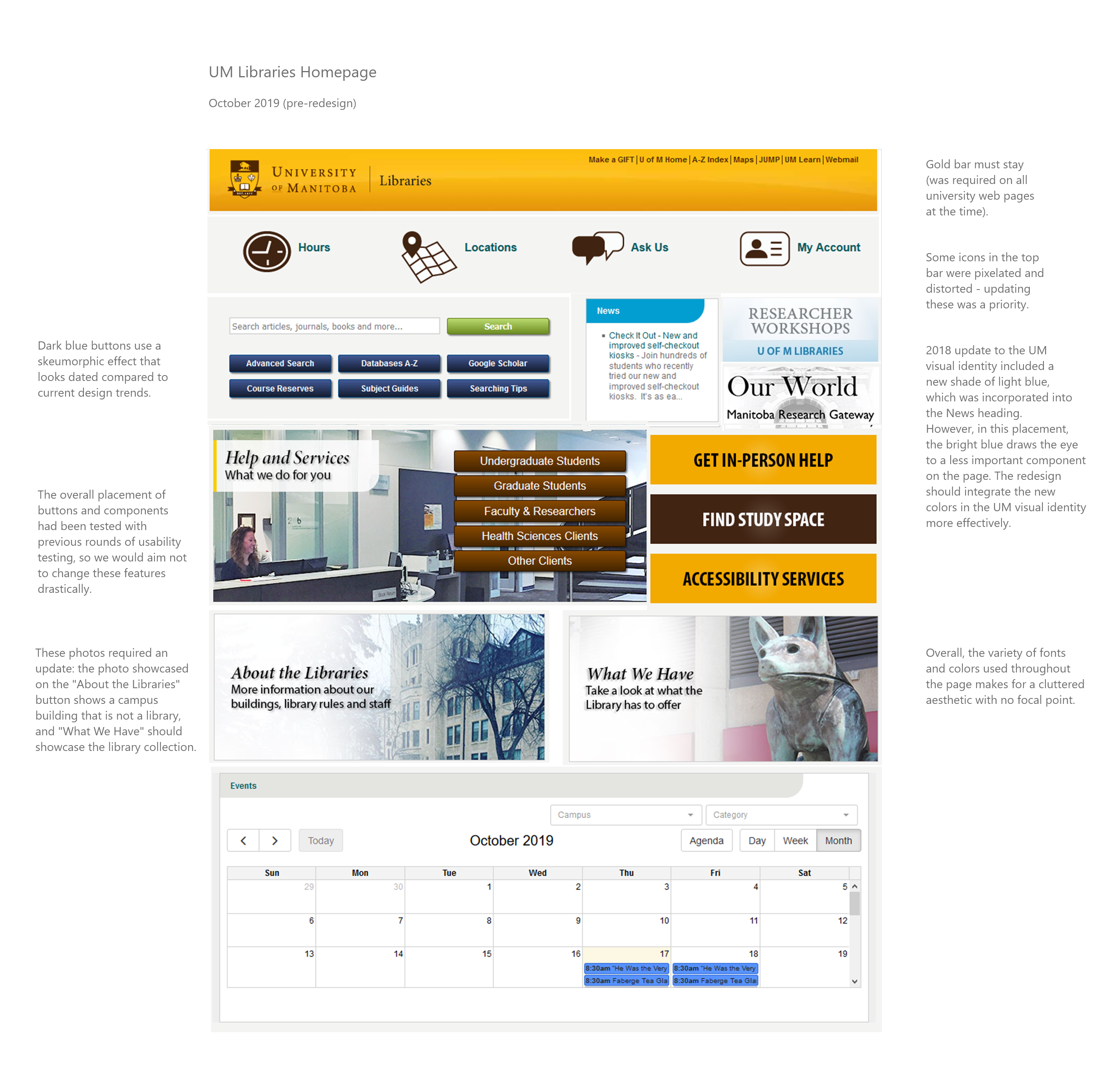
During the Fall of 2019, I worked in the role of UX Librarian for the University of Manitoba Libraries. I collaborated with the Communications Librarian and developers employed by the Libraries to update our homepage. As the Libraries did not have specific staff members dedicated to maintaining the landing page, it had become a collection of different buttons, fonts, and colours. This made it challenging for users to navigate, and aesthetically unappealing.
Context
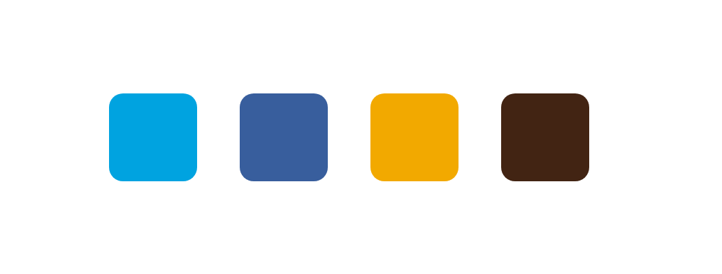
The 2018 update to the UM visual identity included new shades of blue that can be integrated into the design. However, the UM visual identity document states that the traditional brown and gold colors should still take precedence in the overall design of any UM web page.
At this time, the entire university website was undergoing a design overhaul. The Libraries were scheduled to redesign our web pages in 2020; in the meantime, this design update was intended to improve the overall aesthetic of our homepage, and to begin incorporating elements from parts of the UM website that had already been updated.
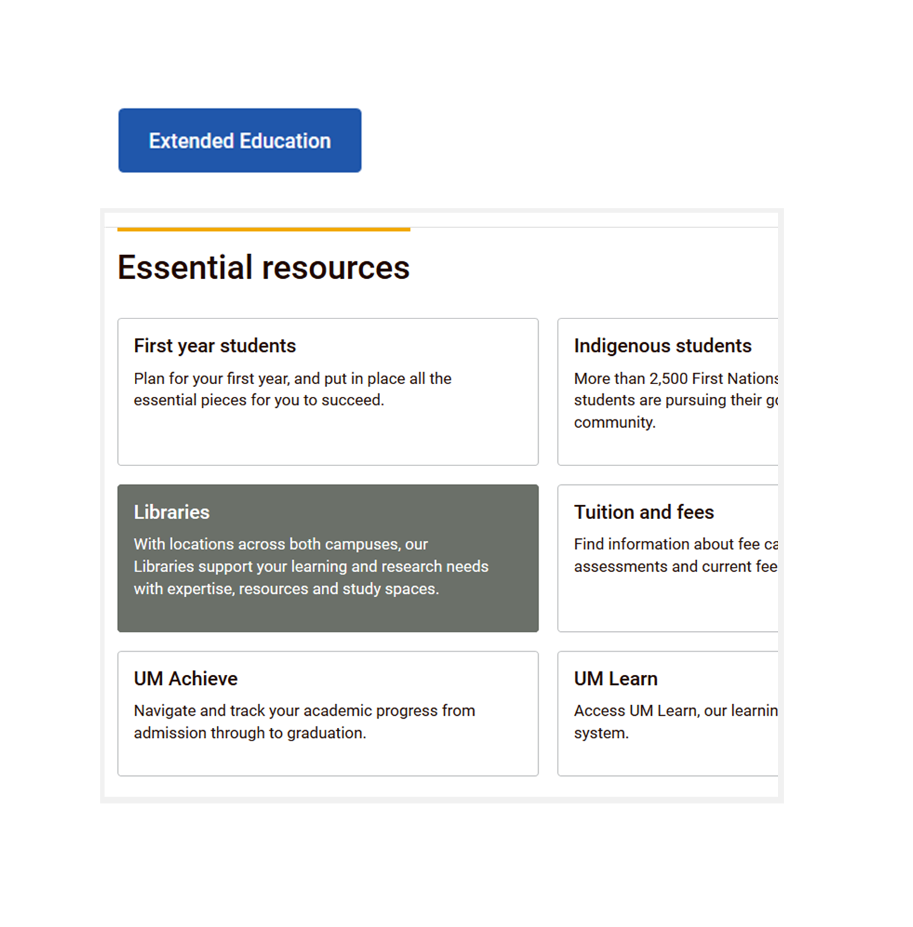
The button and cards pictured above were taken from updated pages on the university homepage, and were used as inspiration for this redesign.
Exploring Icon Options
One priority for this project was to update the icons at the top of the page, some of which appeared pixelated and distorted. Using icons from The Noun Project, I presented a variety of icon options to the team members involved in this project.
We quickly decided that the text accompanying the icons did not need to be a different color to indicate a link, as the icons themselves suggest a clickable component.
We settled on minimal icons drawn in outline, pictured below. As these icons occupy the top of the page, we decided that there was no need to make them stand out visually.
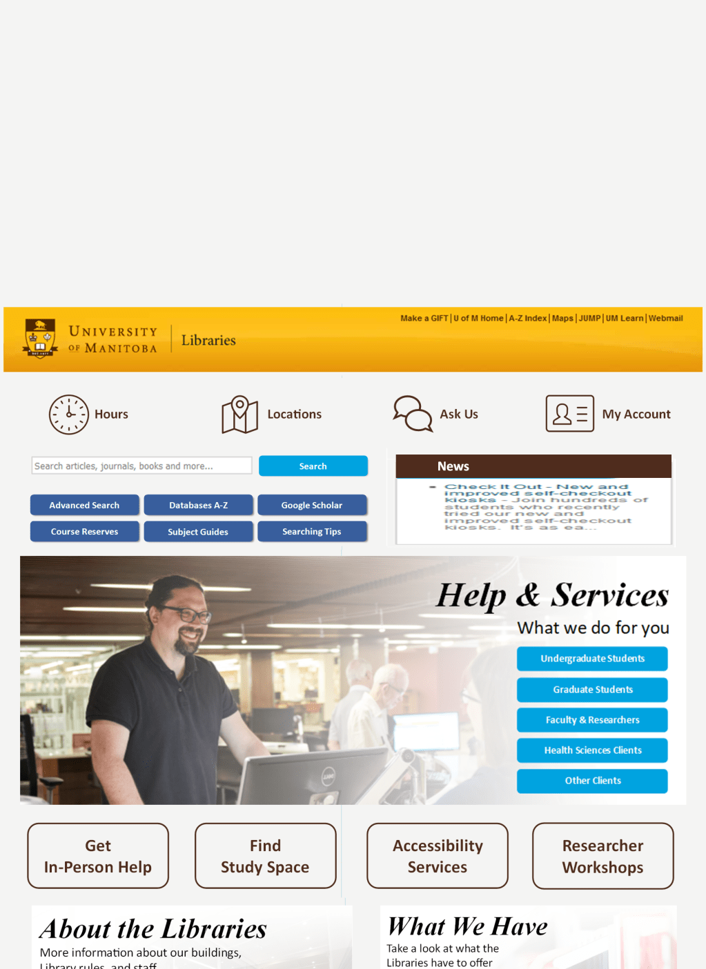
Final Mockup
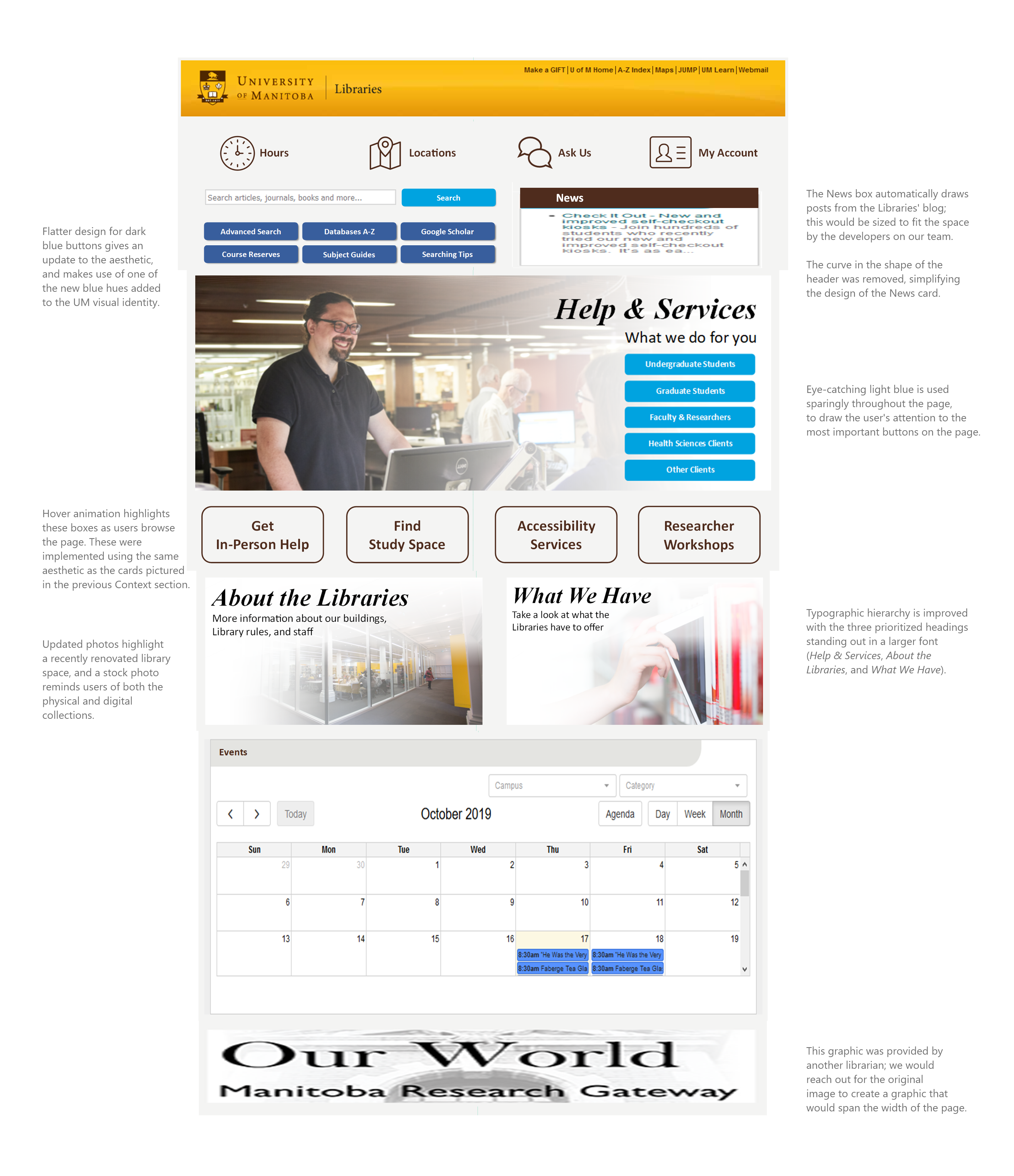
As we were aware that more extensive redesign work would be completed on all Libraries webpages during 2020, we did not make drastic changes to key links and components. The updated design improved the aesthetics of our landing page, while not requiring our users to relearn the locations of their most used buttons and pages.
