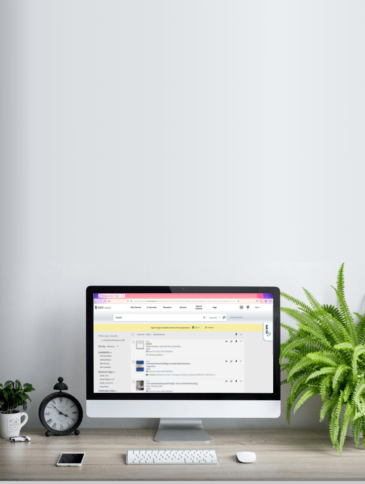
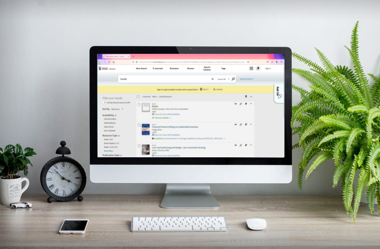
In early 2018, the University of Manitoba Libraries were informed by their search software provider (Primo by Ex Libris) that changes would be coming to the search interface that year. We had the opportunity to tweak many different facets of the interface, and decided to test out the default interface with users before launching that summer.
Key terms used in this study:
- One Stop Search (OSS): the branding used to promote the library search engine during this time
- Primo: the search software provider
- Bannatyne campus: located in the inner city, this campus houses the Faculty of Medicine.
- Fort Garry campus: located in the south end of the city, this is the main university campus, which houses all other faculties.
Round One: Testing with Library Staff
Before testing the new interface with users, we recognized that library staff who interact with users every day would have valuable insights into their pain points with the current interface.
Developing User Personas
I wanted library staff to remind themselves to attempt to see the interface through the eyes of our users, and to try not to make use of their full expertise. To this end, I asked them to adopt one of five user personas, designed to portray the range of users at the university.

Steven (Bannatyne Faculty)
Steven is a recently hired instructor in the Faculty of Medicine. He is a seasoned researcher, but is new to the UofM and to One Stop Search. He has had good experiences with library staff so far, and is comfortable asking for help when he runs into problems with the website. He needs to do some research in preparation for a course he’s teaching next term.
Key points:
- Experienced researcher – good understanding of citations, previous experience with other library systems
- Brand new to our systems
- Comfortable asking for help

Melissa (Bannatyne Grad Student)
Melissa is a graduate student in Pharmacy. She is comfortable using One Stop Search, and has had some library instruction on advanced searching techniques. She doesn’t have a lot of time to devote to finding sources for her research, but is interested in learning about the latest ways to stay up to date on research in her field. She has just learned about a new medication for high blood pressure, and wants to do some research on it.
Key points:
- Fairly comfortable with the system as it is now
- Knows a few advanced searching tricks (but not as many as library staff)

Max (Arts Undergraduate Student)
Max is beginning his second year in Anthropology. He had a couple of assignments in his first year that required him to use One Stop Search, but he’s still not entirely confident when navigating the system. He’s pretty tech-savvy and has a good basic knowledge of how browsers work; because of this, he would rather try to find a solution on his own than ask for help. He has gotten a bit behind with his study schedule, and needs to quickly find some sources for a paper due in five days.
Key points:
- A little experience with OSS, but not much
- Pretty tech-savvy in general
- In a bit of a rush to find resources

Maria (Fort Garry)
Maria has been a professor in the faculty of Architecture for fifteen years. She often alternates between using Google Scholar and One Stop Search to find research material. She’s fairly familiar with the basic functions of One Stop Search, but she’s not highly skilled when it comes to troubleshooting technical problems, and is not as tech savvy as her younger peers. She’s very busy at the moment and needing to do some quick research.
Key points:
- Fairly comfortable with the system
- Not very tech-savvy in general
- Wants fast results

Sally (Science)
Sally is just beginning the second term of her first year in the Faculty of Science. She had an assignment in her first term that involved using One Stop Search to find journal articles, so she has some experience with it, but she wouldn’t call herself a pro-user. She needs to use One Stop Search to find some materials for an assignment due next week.
Key points:
- Minimal experience with OSS
- Young student, used to using Google
Designing the Usability Tests
Test questions were tailored to each user persona, and aimed to cover the most important uses of the search interface: searching for materials, narrowing searches using filters, and using your account to request, renew, and save items. Test accounts were created in the library user database, so that participants could fully try out the functionality of the system.
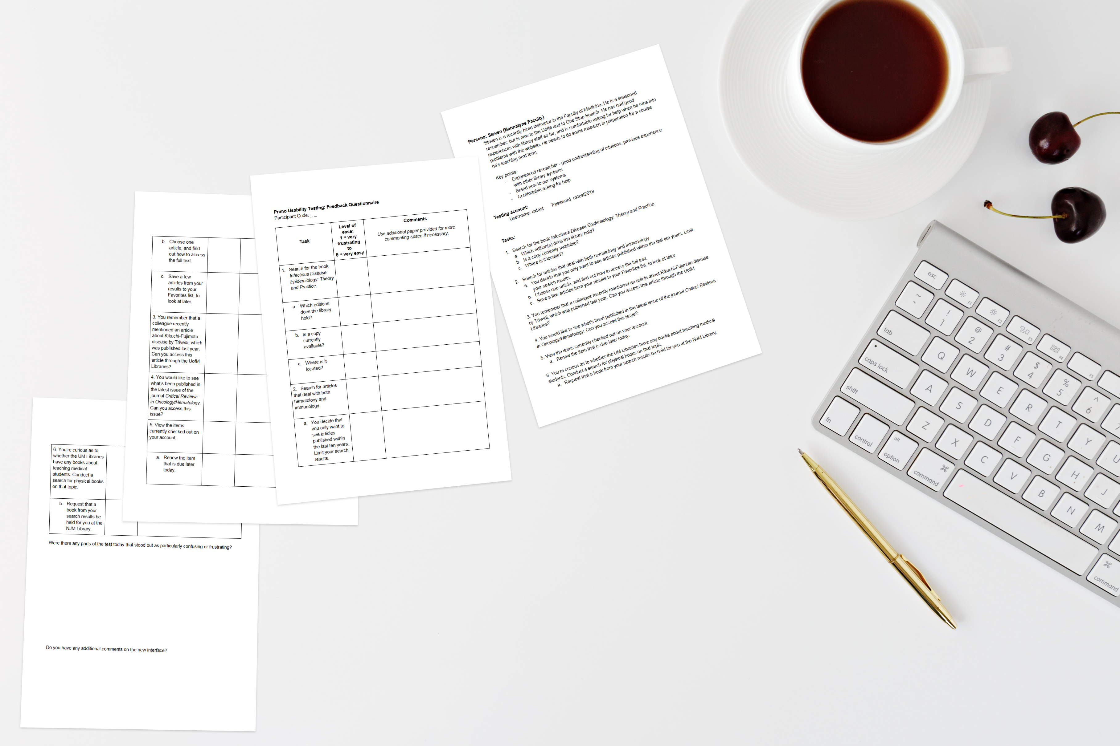
All tasks for participants to complete are provided below.
Usability Testing
Participants were evenly split between librarians (3) and library assistants (3), with a mix of librarians and assistants from the Bannatyne campus (3) and from the Fort Garry campus (3). Confidentiality was maintained by assigning an alphanumeric code to each participant (A1-A6).
Tests were conducted in person at each campus, on desktop computers. The time required to complete each question was recorded, and testers were asked to rate how easy they found each task, from 1 (very frustrating) to 5 (very easy).
Usability Testing Results
The results of this round of testing highlighted three categories of issues to resolve: improving user access to Interlibrary Loan request links; phrasing and icons used throughout the interface; and technical glitches for our developers to investigate.
Facilitating Interlibrary Loan
The question that participants found the most challenging was attempting to access a specific article to which the Libraries did not subscribe. To do this, users needed to get to the point where they could request it via Document Delivery, the Interlibrary Loan service provided by the Libraries. Previously, users would need to use a form located in a different part of the library website to make this request; with this new interface, the option to request a document not included in the collection was embedded within the search. The system offered a number of different routes to this destination, but none proved easy or intuitive for our test participants.
One feature intended to support Interlibrary Loan was a toggle with the words “Include Results beyond UofM”, located in the top of the sidebar on the left side of the screen:
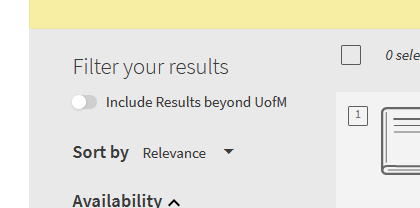
Most participants did not notice this option, or did not consider that it would be a good thing to try. Only participant A3 tried activating this option, after stating that they believed their user persona would give up or go elsewhere for an article we don’t have.
“I’d never think to do that, because I want it from the U of M.”
Participant A1
“Include results beyond U of M never seems like a good idea to me […] If it was clear that we could order things, that would be the only reason to do it.”
Participant A2
To improve this feature, I suggested adding some helpful text to explain this new option:
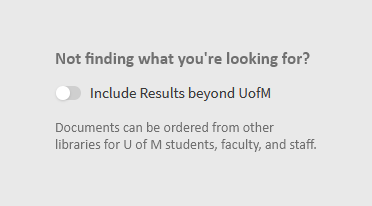
Adding explanatory hover text (“Resources can be ordered free of charge for U of M students, faculty, and staff”) was another feature we decided to test in the next round of usability testing.
Other issues related to accessing Interlibrary Loan are noted below.
| Pain Point | Priority Level | Recommendation |
Interlibrary Loan icon in top right goes unnoticed, and is covered by long patron names | Critical | Remove icon, and investigate whether developers can resolve this spacing issue |
Message when patrons are not signed in lacks a link to sign in, and has unnecessarily complicated wording | Critical | Add link to sign in; simplify wording (“To request this resource from another library, please sign in.”) |
For items we don’t have, “No full-text” is a quick route to an Interlibrary Loan request form. One participant noted that this phrasing did not suggest that the text would link to a request form; no participants used this link to request the document.  | Important | Try changing text to “Order Document”. |
Phrasing and Icons
Many of the default phrases and icons included with this new interface were not ideal. A few of the key issues in this area are outlined below.
| Pain Point | Priority Level | Recommendation |
One participant tried to renew an item that was checked out til end of term; error message only says “Not Renewed”, with no further explanation | Important | More information should be made available as to why it was not renewed: in this case, the user needs to wait until the end of term; in other cases, the item may be requested, etc. Developers to investigate our options for this field. |
| Hover text for icon to exclude resource types leads to grammatically incorrect message (“Exclude This [Resource Type]”, e.g. “Exclude This Conference Proceedings”) | Important | Change hover text to simply “Exclude [Resource Type]” |
When users try to renew an item that has already been renewed, the system displays the awkwardly phrased text “The due date is already set to the renewed due date” | Moderate | Change phrasing to “This item has already been renewed”. |
Icon to save items to user Favorites list changed significantly from previous UI. Testers did not find the pin icon easy to understand; two participants were looking for checkboxes at the top right corner of each item in the list of search results, noting that this is standard in other databases. One participant didn’t find the pin icon intuitive at all: “This isn’t Pinterest”. | Low | This is a feature that would need to be changed from the software provider’s side. We would forward this feedback to them, and make librarians providing instruction aware of this issue. As many researchers use other external tools for managing resources they find, this is not a crucial problem to solve, but an issue to be aware of. |
Technical Issues
As this search software had undergone significant changes, some technical glitches were also discovered that needed to be resolved before launching the new interface.
| Pain Point | Priority Level | Recommendation |
Publication date filter in left-hand menu is difficult to use, according to four testers. When participants tried to use the filter a second time, the system applies the first dates they used, regardless of the new numbers entered. In the example pictured above, 1975-2018 was entered as the new publication filter, but the system continues to show the first filter. | Critical | Ask developers to investigate, and forward feedback to search software providers |
In Advanced Search, the “Author/creator” field is cut off. This only happens in Firefox, not Chrome.  | Important | Ask developers to investigate, and forward feedback to search software providers |
Sometimes the information for a seemingly random item shows up in the bottom left corner of the Overview page. In the example pictured below, The Story of Stuff is just a result from the search on the previous page; I had added a different item to my Favorites list, but hadn’t interacted with The Story of Stuff at all. | Important | Ask developers to investigate, and forward feedback to search software providers |
Detailed testing data is available in the file below.
Round Two: Testing with Students and Faculty
Having resolved many small glitches and improved the phrasing used throughout the interface, we wanted to test out our improvements with real users. Two sets of test questions were developed, tailored to Arts and Health Sciences users respectively. Questions aimed to assess the effectiveness of the changes implemented following the last round of tests, and to cover the most important uses of the system: searching for materials, narrowing searches using filters, and using your account to request, renew, and save items.
Participants for these tests were limited to University of Manitoba graduate students, undergraduate students, faculty members, and instructors. We also included one student from the International College of Manitoba program; although these students are not our primary users, they can provide insights from the perspective of students who are preparing to enter university studies. Participants were self-selected volunteers recruited via email and advertising posters on the university campuses.
| Participant Code | Demographics | Department |
| A1 | Graduate student, international | Linguistics |
| A2 | PhD candidate, international | Economics |
| A3 | Professor | Economics |
| A4 | MSc Student | Pharmacy |
| A5 | Senior Instructor | Pharmacy |
| A6 | PhD candidate, international | Economics |
| A7 | Instructor | Nursing |
| A8 | International College of Manitoba student | International College of Manitoba |
| A9 | Undergraduate student, international | Science |
| A10 | Graduate student | Human Nutritional Sciences (Agriculture) |
Pre-Test Questionnaire
Participants were provided with a brief pre-test questionnaire to gauge their familiarity with our current search interface, and to provide insight into their typical research habits.
The results of this questionnaire revealed that all users had at least some experience using the search interface within the last three months:
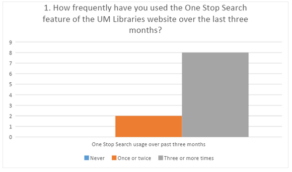
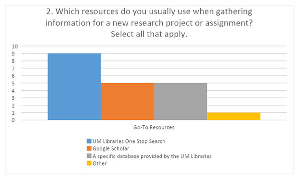
Only one participant (A4) noted that they do not use One Stop Search when starting a new research project. “Individual journal websites” was noted for the participant who included Other (A4).
Usability Testing Results
Facilitating Interlibrary Loan
Accessing an article to which the Libraries don’t subscribe was assessed with question 3 for both Arts and Health Sciences users. This remained the most challenging question, which was not surprising. Two participants were able to successfully request an item not held by the Libraries without any guidance. Other users noted that they would switch to Google Scholar when no results came up (A9, A6, A5), or go straight to the Document Delivery pages on the website (A10, A6, A1), or ask library staff for help (A7).
| Pain Point | Priority Level | Recommendation |
| “Order Document” text to link to Interlibrary Loan request form: testers who were not already familiar with the Document Delivery service (A2 and A8) did not find this phrasing helpful; some participants noted that “Order” sounds like a fee might be involved. | Critical | Update phrasing to “Request with Document Delivery” |
| Include results beyond U of M remained challenging to find for most test participants. • A4 found and made use of this feature • A1 and A3 suggested that this option would be easier to find if it was in the center of the screen • A10 suggested highlighting this option in various library news outlets, as they found it useful, but they would stick with the options they know (their usual links to the Interlibrary Loan order forms) rather than hunting around the webpage for more options. | Low – in discussion with the new interface implementation committee, we decided that this feature was useful, but not critical to the successful use of the system. | Remove extra text added after last round of testing, to make for a less cluttered interface overall. |
Phrasing and Technical Issues
A few additional phrasing issues and technical glitches were uncovered during this round of testing.
| Pain Point | Priority Level | Recommendation |
| Accessing My Account – when users hover over their account name, the hover text reads “Click to sign out, change language, or view library card”. Many users read as far as “click to sign out” and then moved on. Only A4 and A5 had no issues finding My Account with this hover text; it was notably difficult to locate for 5 participants (A2, A3, A6, A7, A8). | Critical | Change hover text so that “Click to access your account” is the first thing that users will see. This change was implemented before the last two tests took place (A9 and A10), and both of those users had no problems finding the link to My Account. |
| Request button is finicky – users must click on the button itself, and not the letters on the button, for it to function properly. A3, A7 and A8 had some trouble with this. | Important | Ask developers to investigate, and forward feedback to search software providers |
| Small arrow next to loans in My Account – testers anticipated being able to click this to view more information about the loan, but the arrow is currently not set up to expand the item box. | Important | Ask developers to investigate, and forward feedback to search software providers |
| “E-book” and “Electronic book” are included as subject tags for some records. This was confusing for 3 participants (A5, A7, A8). If we exclude this subject filter, it doesn’t exclude all e-books; resources must be filtered by type via the “Resource Type” filter. | Important | This subject tag is automatically imported from certain databases. Metadata librarian on staff will investigate. |
Other Issues
- Publication Date filter – with the technical glitch resolved before this round of testing, fewer participants had trouble with this feature. 90% of testers completed the question testing this feature (question 2.a) without help.
- Saving articles to your Favorites list – half of our participants (A9, A7, A6, A3, A2, A1) struggled to find out how to accomplish this, although 70% were able to accomplish the task (question 2.b). Four testers commented that they found the pin icon fairly intuitive (A10, A8, A5, A4).
- Some noted that they already have methods in place for saving articles (e.g. citation management software such as Zotero), so this is not a feature they would use.
Detailed testing data is available in the file below.
Additional Insights from Testing with Users
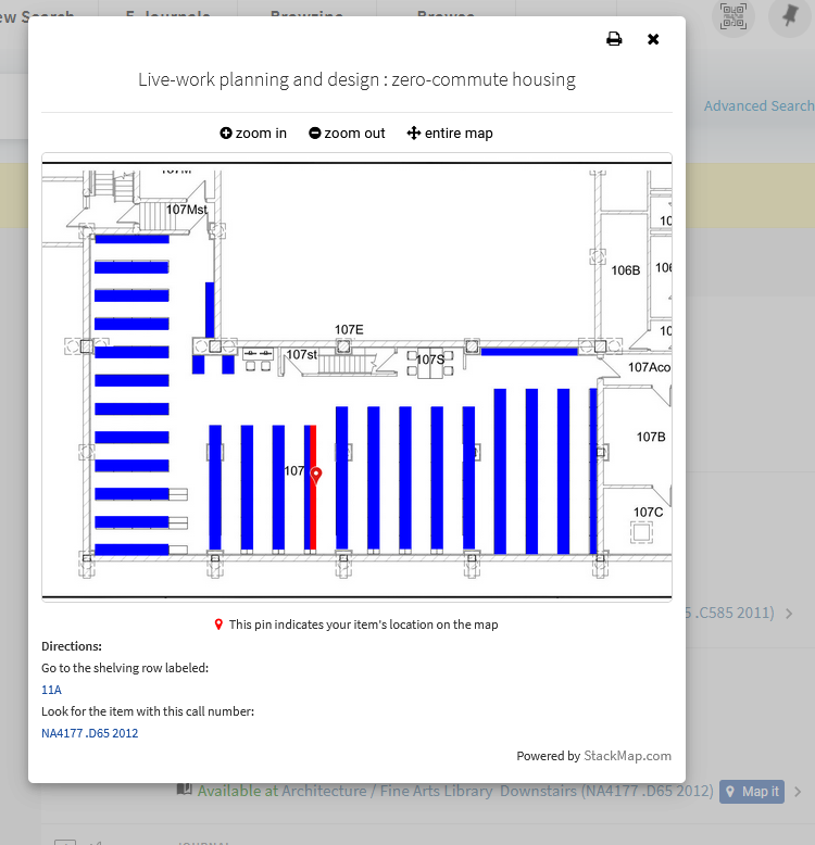
Library staff rarely consider using the “Map it” feature, due to a familiarity with navigating the stacks, which they often take for granted. Two testers used this feature when determining the location of a book, with one tester in particular commenting on how helpful they found that feature.
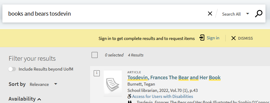
Participants in this round also demonstrated the need to capitalize Boolean operators in this system. Some testers remembered that boolean operators such as “and” could be placed between keywords, but did not capitalize, leading the system to understand “and” as a keyword. This mistake is useful for librarians to be aware of as they provide research instruction.
Staff Training and New UI Launch
Features and remaining issues with the new interface were demonstrated for all library staff. Demonstrations were held in person at both campuses and via online webinar, to allow most staff to attend. The testing process was discussed, and staff had the opportunity to ask questions, in order to be prepared to guide users while adjusting to the new interface.
In retrospect, although the new UI was a substantial change from the previous format, library staff were able to confidently advocate for these changes due to this training. The usability testing process was vital to resolving many of the existing problems prior to launching the new interface.
